

What a brand system owes its engineers.
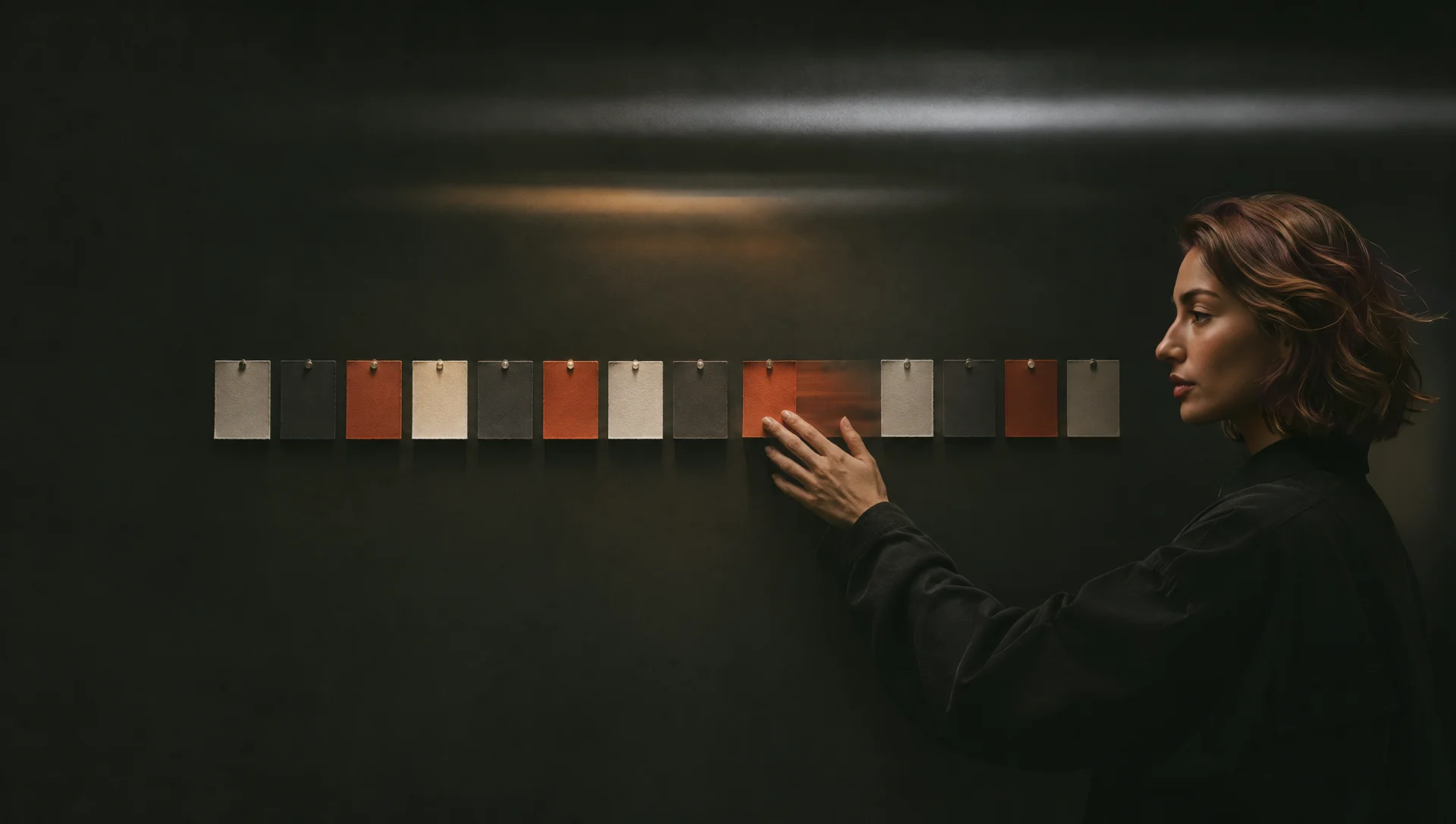
A brand system owes engineers three things: names for recurring design decisions, clear rules for how components behave, and a way to check the result in a working product.
Give the colour a job
Imagine an appointment picker. The brand uses a deep red. A designer colours the selected time red in the mockup. A week later an engineer adds a message for a slot that has just been taken. Should that be red too? The palette alone leaves both choices open.
A design token is a named design decision. We would give the selected slot and the error message separate roles, such as selection.background and feedback.error.text. Even if they share a colour today, one can change later without repainting the other. A check mark and the word “Selected” also tell the customer which time they picked.
Describe what happens after the click
The most useful handoff note for that screen might be a single sentence: “Keep the chosen time visible while we check availability.” It gives engineering a decision to implement and gives the designer something to verify.
Walk the same control through a slow connection, a keyboard interaction and a lost slot. While the request runs, keep the date in view and prevent duplicate requests. If somebody else books first, explain what happened beside the time picker and let the customer choose again without re-entering their details.
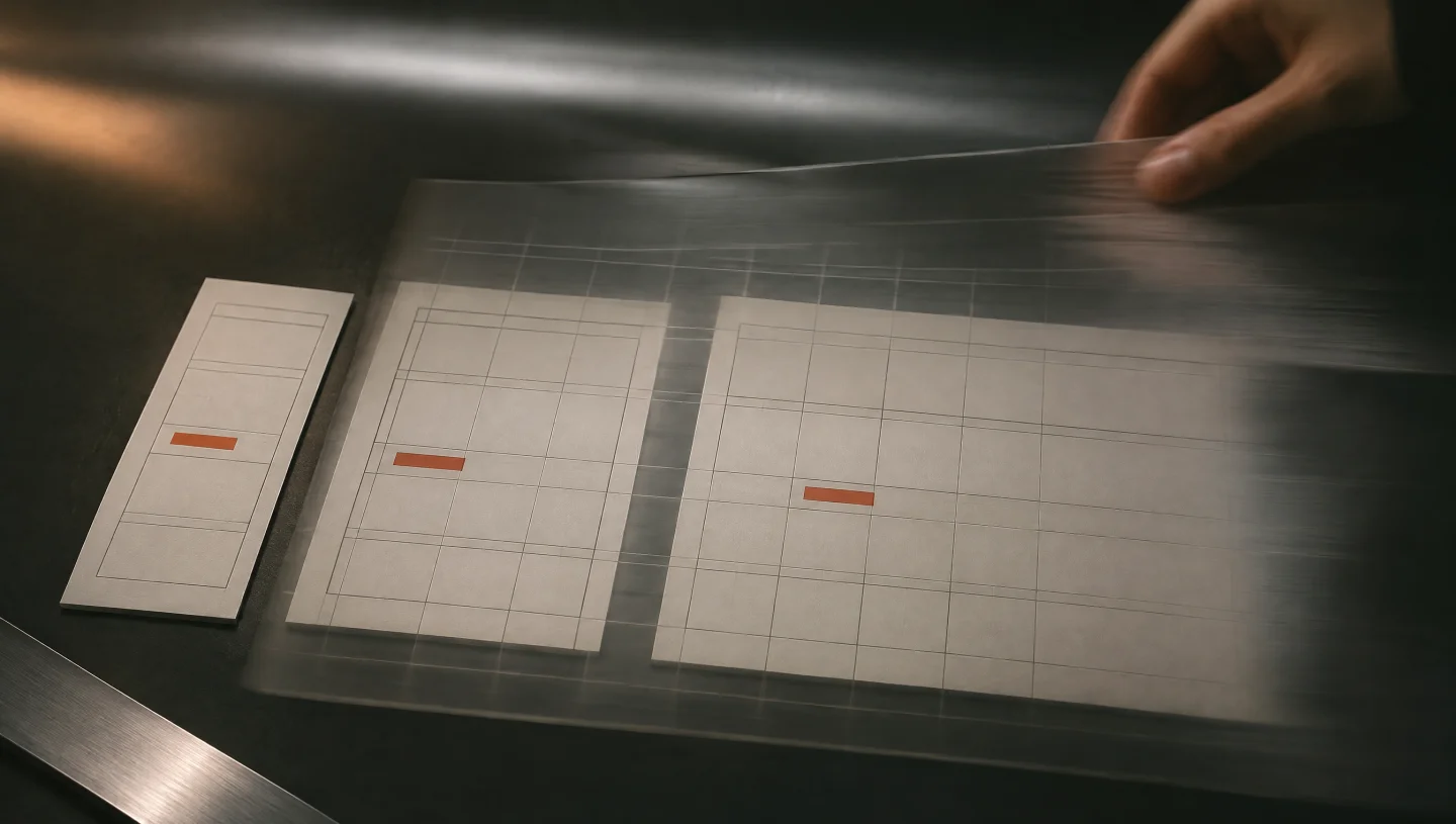
Take the system into the browser
Open the picker at a narrow width, switch its language and enlarge the text. A long month name can push the next-month button off screen. The team can decide once that the heading wraps and the navigation keeps its space. Reviewing that rule on a working component gives it a life beyond this one screen.
For the next release, ask a developer who missed the original review to build the rescheduling screen. Can they find the selected state, reuse the recovery message and predict what wraps? Each question they still have tells you exactly where the brand system needs another example.
See how we apply these handover decisions in our UI/UX design and design systems work for idefix and Koton.